Tong Fu 童孚 | Brand identity
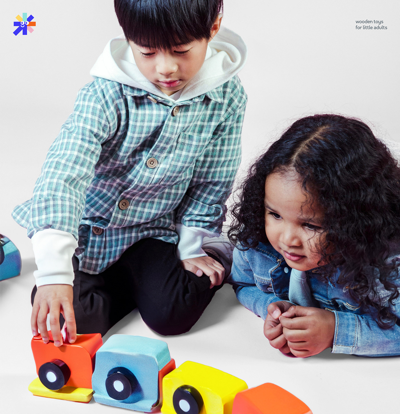
[en] Tong Fu is a brand of toys and furniture for children that embodies the idea of perceiving the world through the eyes of a child. The brand's mission is to develop children's thirst for knowledge and the joy of discovery with the help of unique toys and furniture. Toys not only develop imagination and creativity, but also provide access to an exciting world of knowledge. Tong Fu strives to give children the keys to an endless world of possibilities, inspiring every child to be themselves.
One of the goals of branding is to highlight the uniqueness and diversity of children, seeing in each of them a source of bright ideas and amazing individuality.
The task is to create bright, interesting branding that will reflect the brand’s values and will be convenient and easy to use
[ru] Tong Fu — бренд игрушек и мебели для детей, воплощающий идею восприятия мира через глаза ребенка. Миссия бренда — развивать у детей жажду знаний и радость открытий с помощью уникальных игрушек и мебели. Игрушки не только развивают воображение и творческие способности, но и открывают доступ к захватывающему миру знаний. Tong Fu стремится подарить детям ключи к бескрайнему миру возможностей, вдохновляя каждого ребенка быть самим собой.
Одна из задач брендинга — подчеркнуть уникальность и разнообразие детей, видя в каждом из них источник ярких идей и потрясающей индивидуальности.
Задача — сделать яркий, интересный брендинг, который будет отражать ценности бренда и будет удобным и простым в использовании
Designer — Darabamse
Client — Tong Fu, China


Logo idea
[en] An important brand value is treating children as adults. Therefore, the font in the logo was created using a strict, “adult” style. At the same time, we preserve childlike spontaneity, reflecting the rebellion and uniqueness of characters through the uneven design of letters.
[ru] Важная ценность бренда — отношение к детям, как к взрослым. Поэтому шрифт в логотипе был создан с использованием строгого, «взрослого» стиля. Вместе с тем, мы сохраняем детскую непосредственность, отражая бунтарство и уникальность характеров через неровное оформление букв.


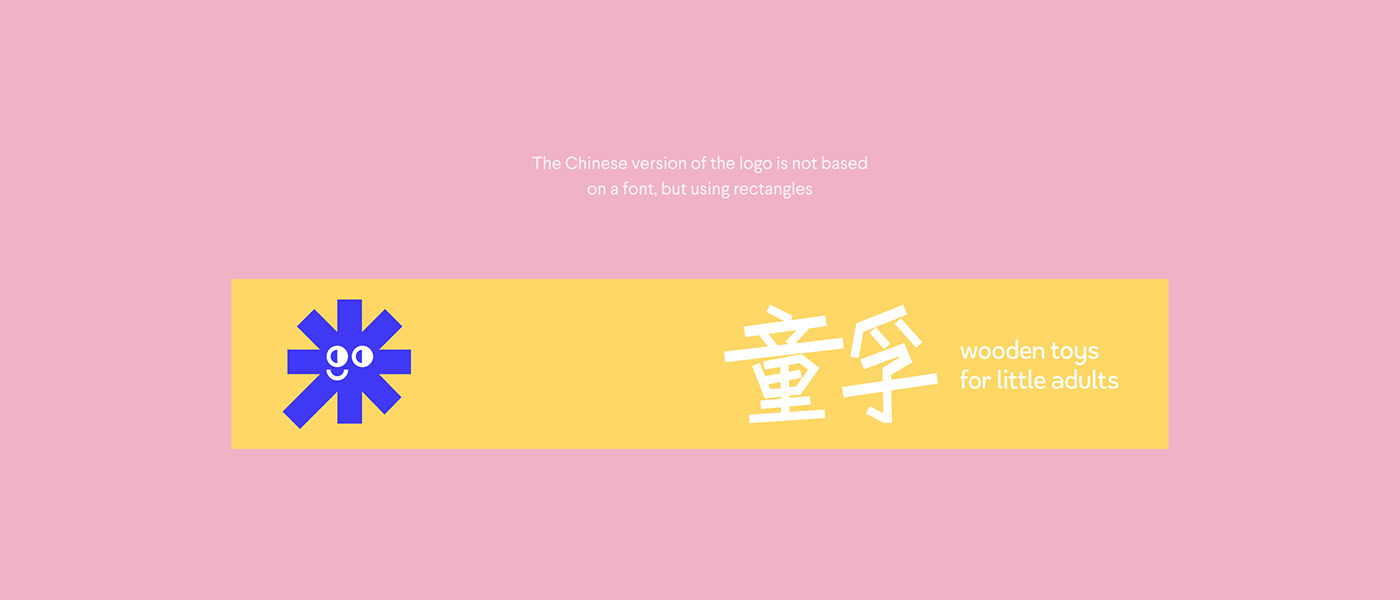
[en] The logo uses a metaphor to show that every child is unique, like a ray of sunshine that strives to develop and grow. This symbolic image is reflected in the brand logo, where multi-colored rays corresponding to the brand colors are directed upward, symbolizing the growth and development of children playing with our toys. These rays also express the diversity of children and their natural spontaneity. To add liveliness, the sun in the logo is complemented by eyes and a smile taken from the letters of the logo.
[ru] В логотипе использована метафора, показывающая, что каждый ребенок уникален, подобно лучику солнца, который стремится к развитию и росту. Этот символический образ отражен в фирменном знаке, где разноцветные лучи, соответствующие цветам бренда, направлены вверх, символизируя рост и развитие детей, играющих с нашими игрушками. Эти лучи также выражают разнообразие детей и их естественную непосредственность. Для придания живости, солнце на логотипе дополнено глазами и улыбкой, взятыми из букв логотипа.


[en] A slogan was invented for the brand: «Every kid has its own power». It conveys that every child is unique and has his own strength, ability or talent. And the brand’s task is to use games to help every child reach their potential and achieve heights.
[ru] Для бренда был разработан слоган — «Every kid has own power». Он несет в себе то, что каждый ребенок уникален и обладает своей собственной силой, способностью или талантом. А задача бренда — с помощью игры помочь каждому ребенку раскрыть свой потенциал и достичь высот.

[en] The packaging continues the idea that children are rays of sunshine. Therefore, all packaging (boxes, bags, business cards and other printing) is made in stripes of the brand’s colors. Also, for ease of use of the packaging, we thought about printing the name of the product on the cardboard cover, and not on the box itself. Thus, we have achieved versatility of use and environmental friendliness.
[ru] В упаковке продолжается мысль о том, что дети - это лучики солнца. Поэтому вся упаковка (коробки, пакеты, визитки и другая полиграфия) выполнена в полосках из цветов бренда. Также для удобства использования упаковки, была продумана печать названия изделия на картонной накладке, а не самой коробке. Таким образом мы добились универсальности использования и экологичности.


[en] While the brand exists online, parcels with toys are delivered in cardboard boxes, and the toys themselves are in linen bags in which they can then be stored.
[ru] Пока бренд существует онлайн, посылки с игрушками доставляются в картонных коробках, а сами игрушки находятся в льняных мешочках, в которых их потом можно хранить.